OpenRefine Tutorial Cleaning and analyzing dirty data
OpenRefine is a powerful tool for working with messy data
- detect and fix inconsistencies
- transforming data from one structure or format to another
- connecting columns with other datasets
Let's get started

Click Choose Files, Browse for the BAA dataset, select BAA.xls and click Next >>

This is a preview of how the data will be sorted. OpenRefine does a pretty good job of detecting the form that's being brought in.
Name the project Cleaning BAA Data and click Create Project

Only the first 10 rows are displayed so it doesn't overwhelm your computer. There's 35,384 rows of runners. We don't need to see them all, we only want to see the patterns.
Facet Counts
Let's narrow it down to just the USA. Select the arrow button by CountryRes and click Facet > Text Facet
A box will show up on the left that is essentially a pivot table that you can sort by name or count.

Scroll down to the US and notice an issue

Quick edit of values via Facets
Let's clean that up by clicking the edit link by U.S.A., replacing the "U.S.A." with "USA" and clicking Apply.

You'll see Mass edit 20 cells in column CountryRes at the top.

The simple procedure you did was a mass Find/Replace for all U.S.A.s in that CountryRes column. Now there's 30,060 USAs and no U.S.A.s
What are the top 5 countries sending over marathon runners to Boston? Click Sort by Count and you'll see USA, CAN, GBR, MEX, and ITA
Lets find out the oldest person running in the marathon Click on the arrow by AgeOnRaceDay and click Facet > Numeric Facet

Uh oh, this doesn't look right.

"No numeric value present"? That means GoogleRefine doesn't recognize those numbers in that column as numbers. This is a problem that can prevent accurate calculations, visual representations, and categorization.
Transforming values
Click arrow > Edit cells > Transform
Replace value with value.toNumber() and click OK.


(Another easier way is to right click common transformations >> To number)
Now the numbers in the column have turned green and there's a histogram of numbers on the left.

You've transformed a column with code. Here's some other transformations you could've done- https://github.com/OpenRefine/OpenRefine/wiki/Understanding-Expressions
Subsetting data for analysis in OpenRefine
Click and drag the left scroller to the far right so the 83-84 is isolated
The oldest racer is an 84 year-old woman from Spokane, Washington.
What's the most common age? You could drag the scroller so that only the tallest histogram bar is isolated, or to be more accurate, on AgeOnRaceDay, click arrow > Facet > Text Facet and select Sort by: Count on the left.

The most common age among runners is 45.
What's the most common age for male versus female? Add a Text Facet to the GenderCode.

Looks like there's 15,964 females running and 19,420 men. Click on F
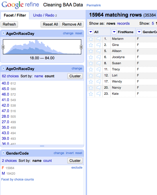
The most common age for female runners is 40 with 612. Click on the M and the most common age is 46.
Close out all the Facet/Filter boxes on the left by clicking the X's at the top left.
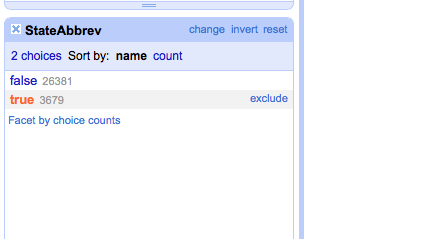
Where's the dirty data? Here it is: We're going to focus on runners from the state of Massachusetts.
Two ways to do that from the StateAbbrev column.
Like before, select Text Facet and scroll down to MA and select it, to narrow it down on the right.
Click arrow > Text Filter and type in MA.

There's 7,890 runners from Massachusetts.
Which towns have the most runners?
Run a Text Facet on the City column. Scroll through and if you know your towns, you'll see some interesting spellings.
Cleaning up dirty data with OpenRefine

There's only 352 towns in Massachusetts but this list says there's 426. It will be too difficult to go through 7,890 rows to see if all the towns are correct. That will take up too much time.

What's this? Look closely and it's because there's an extra space at the end of Brookline.
Edit cells >> Common transforms >> Trim leading and trailing whitespace
OK, that's one value cleaned up. Next, click the Cluster button

There are various methods that Google Refine uses to detect similar cell values.

You could go ahead and check the Merge? box and click Merge Selected & Re-Cluster at the bottom BUT we're making an executive decision to spell out all town names. No Abbreviations allowed.
So for this example, check the Merge? boxes but change the New Cell Value to spelling out the directions- E = East, etc. Then click Merge Selected & Re-Cluster

Go through the rest of the Keying Function options and merge the appropriate suggestions.
Here's a list you can check to cross-reference correct town name spellings.

Now select Method: Nearest Neighbor in the top left drop down menu

Merge the appropriate towns. After you've gone through as many options as possible, close.
There should be about 390 choices left out of 426 originally. Not bad. But there's only 352 towns in Massachusetts.
What else can we do? Let's get rid of abbreviations. Run a Text Filter with a search for "."

Edit and spell all those out. Close out the filter and you should have 383 choices.
Gotta get more specific. Sort the City column Text Facet by Count and look at the names with low or single digit counts. This is where you can look for odd ones like, "Williamsburg, Ma." Change those manually.

Let's stop cleaning data. It will take a while to finish (but not nearly as long without assistance from OpenRefine).
Here's the cleaned up list, if you're curious [link]
The next step is thinking about visualizing the data. We'll make a choropleth map, a thematic map in which areas are shaded in proportion to the measured variable.
For this map, we'll shade it based on numbers of runners from each state in the U.S. We need to prepare the data.
Counting up values in columns with OpenRefine

Back to the dataset. Eliminate any facets you've previously created.

Let's make a quick Text Facet of all the StateAbbrev.

Now we've got a column for reference. We want this count list but we want it in a column format. We could just make a spreadsheet by hand, but that will take way too long.

Click arrow > Edit column > Add column based on this column.

Type in facetCount(value, "value", "StateAbbrev") and then OK.

Eliminating duplicate rows
For this map's purpose, we don't need any individual data. We just want StateAbbrev and count.

Click StateAbbrev arrow > Edit cells > Blank down.

Click State Abbrev arrow > Facet > Customized facets > Facet by blank.
Click true.
Click State Abbrev arrow > Facet > Customized facets > Facet by blank.

Click All arrow Edit rows > Remove all matching rows.
Merging columns with a different data set in Open Refine
Download this spreadsheet of U.S. States. [link]
Open a new tab of OpenRefine and create a project using the States spreadsheet you just downloaded.
Call the project states.

Simple. This is the format that will be recognized by the map generator.
We need to bring the counts for each state over.

Click Abbrev arrow Edit column > Add column based on this column.

Type cell.cross("Cleaning BAA Data", "StateAbbrev").cells["count"].value[0] and click OK

It worked! Except that the column is in the wrong position.

Click count arrow > Edit column > Move column right

Brilliant!
Click Export> Excel (or CSV, up to you).